UPDATE 2: It has been brought to my attention that there is in fact Yoshi’s Island artwork on the soundtrack that shows of green Yoshi in that pose. The red artwork came first (being on the box) but a green one did exist before smash.
UPDATE: new proof has come to my attention that shows that both Pokemon artwork is actually from the Japan version of Pokemon Blue and not the TCG and Anime.
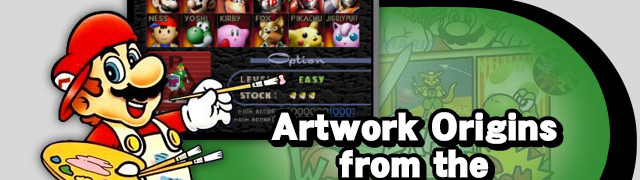
The character selection screen of every Super Smash Bros. title is always something that sparks excitement among fans, more so before the games release than after. Since Super Smash Bros. Melee, the character icons on the CSS have always used new artwork created specifically for the game. However, despite having original cartoon-like artwork (which can be seen on the box art or in the manual), the character select screen for the original Super Smash Bros. for Nintendo 64 opted to use official artwork of the characters from their original series instead. While I can not verify a reason for this, one theory is that it was not a priority to make unique CSS icons for the fighters and so it simply never happened. A more likely reason, however, is that this was done to make the characters more recognizable. Remember that this was the first smash game, so fans of these characters would only know them from their original source games.
Today, I thought it would be fun to look at the artwork they used in the Smash Bros. 64 CSS (as well as the game’s intro as they share this artwork with the exception of the unlockables) and identify where the artwork came from originally. I have decided to split this into two parts, the characters that are exactly identical to their original artwork and then the characters that have some changes. I am doing this because those characters have some really interesting changes.

Keeping it True to the Source


Original Source: Super Mario 64
Mario’s artwork is taken directly from Super Mario 64 and is essentially a perfect match. The colours are slightly lighter in the Super Smash Bros. version, a common theme found in the CSS portraits. This artwork was likely chosen as Super Mario 64 was the latest game in the main Mario series at this time and many of the Mario themed assets in Super Smash Bros. (like Mario’s model or Peach’s Castle) come from that game.


Original Source: Donkey Kong Country
Donkey Kong’s artwork is taken from the first Donkey Kong Country game on the SNES. Just like the Mario render, it is pretty much a perfect match except for a touch-up to the fur in the Smash Bros. render. Unlike Mario, however, Donkey Kong’s artwork is taken from the first game that this version of Donkey Kong appeared in. The reason for this is most likely two-fold: much like with Mario, the DK Stage Congo Jungle is based on the same game as the render – Donkey Kong Country. The second reason is most likely due to the fact that despite being the titular hero, Donkey Kong is only playable in the first Donkey Kong Country title (as Diddy Kong and Dixie Kong took his place in the sequels). It therefore makes more sense to use a render of Donkey Kong from when he was playable rather than from when he was a simple NPC.
.png/revision/latest?cb=20111017150232)


Original Source: The Legend of Zelda Ocarina of Time
Link’s artwork is clearly based on the Legend of Zelda: Ocarina of Time. The render itself is pretty accurate but there are some slight differences, most notably the nose and eyebrows. Ocarina of Time was the latest Zelda game at the time of the original Super Smash Bros. and it is because of this that Link’s character model and the stage Hyrule Castle (as evident by the background elements of that level) are based on it . However, both the stage, the model, and the render are not completely accurate and while this may just be a purposeful edit made by Sakurai, I believe there is a better reason. Zelda content in Super Smash Bros. 64 is inaccurate because the two games were made simultaneously. The Legend of Zelda: Ocarina of Time came out 4 months before the original Super Smash Bros. and by the time of it’s release everything would have been finalized for Super Smash Bros. 64. Sakurai has previously stated that the reason why Adult Link has a boomerang in Smash when he cannot use one in Ocarina of Time was because he did not know of this fact (and other details of Ocarina of Time) during development. This also explains why Hyrule Castle and the surrounding area is different in Super Smash Bros. compared to how it looks in Ocarina of Time. Due to all of this, I believe Sakurai was basing the Link character model and render from beta artwork of Link. The one i have shown above is the most accurate to Link’s final render as the nose is smaller and not as pointy, just like in Smash.


Original Source: Super Metroid
Samus’ artwork is based on her design from Super Metroid but has been edited to look more like a 3D render in order to match with the others. This effect is used by all of the remaining renders with the exception of Fox and possibly Luigi (but he is a special case). Super Metroid was the latest game released in the Metroid series at this time as the N64 never saw a Metroid game get released or even go into actual development. Much like the stages for the previous fighters, the Metroid stage Planet Zebes is based on Super Metroid as evidenced by the sprites of Ridley and Wavers from Super Metroid flying around in the background.


Original Source: Super Mario World 2: Yoshi’s Island
So this render was a pain to find. After scanning through various art of Yoshi from all of the games he starred in before Super Smash Bros. I began to think the render was original. It clearly was not based on the Yoshi from Yoshi’s Story as, despite the stage Yoshi’s Island being based on that game, the model used for Yoshi was based on a mixture of his Super Mario World and Yoshi’s Island model. Before writing it off as an original I suddenly got the idea to check the box art for the Yoshi games and lo and behold a slightly different coloured but perfectly posed yoshi was looking right back at me. The red yoshi found on the center of this box art matches the render to near perfection with the only the only differences being the 3D effect and the obvious different colour of the Super Smash Bros. render.
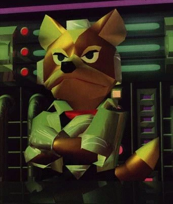

Original Source: Star Fox 64
Fox’s artwork comes from Star Fox 64 which is unsurprising because all of the Star Fox elements in this game, from his fighter model to his stage, Sector Z, are taken from Star Fox 64. However, there are two slightly odd differences between Fox’s artwork and his render. The first is a bit difficult to say with full confidence but it does not appear as though Fox’s arms are crossed in the Smash render like they are in the original. I believe this because his red scarf is more visible in the Smash render, however I cannot say for sure if his arms are just slightly lower and are being cut off by the CSS icons borders or if they are not folded at all. The second oddity is more obvious, though: the silver part of his helmet that you can see at the top of his head (in between his ears). While clearly visible in his original artwork it is completely missing in his Super Smash Bros. render. It is not like his model had that part of the helmet removed so I can only believe that it was done here on purpose so as to stop the grey from clashing with his name as they appear in a similar colour.


Original Source: Pocket Monsters Blue Version
UPDATE: Pikachu’s artwork came from Pocket Monsters Blue Version and not the TCG. It seems it was used in CoroCoro magazine adverts for the game before it was used in the cards. This not artwork used in Red & Green versions of the game as this is the redesigned Pikachu that western audiences saw and not the really fat original (although he is still a little chubby).
So in a bizarre twist, both Pokemon artworks featured on the CSS in Super Smash Bros. do not originate from one of the Pokemon video games. Instead, Pikachu’s artwork is actually based on two different cards from the Pokemon Trading Card Game series, specifically the Wizards Promo 1 card only released in Japan and then the Wizards Promo 4 card (pictured above) that saw a western release only to fans who went to see the first Pokemon Movie. The image did appear within the game boy title Pokemon Trading Card Game along with other special Pikachu cards like surfing Pikachu and Flying Pikachu. The only difference between this artwork and the one found in Smash is the 3D effect much like with other characters with 2D artwork being used.
![039Jigglypuff_RG_2[1]](https://i0.wp.com/www.sourcegaming.info/wp-content/uploads/2015/10/039Jigglypuff_RG_21-278x300.png?resize=195%2C210)

Original Source: Pocket Monsters Red/Green Version
UPDATE: Jigglypuffs’s artwork came from Pocket Monsters Red/Green Version and not the TCG. The anime’s artwork seems to be based on this artwork. The original even has the blue eyes that the anime version lacks. This artwork was used in the official Red & Green strategy guide.
Just like with Pikachu, the art used as reference for the Super Smash Bros. render is not from the video games but instead a non-video game source: this time it was the recently popular anime. Sakurai has said before in an interview that the anime played a very important role in deciding which Pokemon would be included in Super Smash Bros. as fighters as there were 151 pokemon to choose from at the time. Jigglypuff was a recurring character in the anime and Sakurai believed she/he would make a good joke character for this game. So with the anime being the main influence for this character’s inclusion it makes sense that the render used is based on the anime. The portrait is, however, edited to resemble the in-game artwork of Jigglypuff instead. This is specifically the eye-colour which is blue in the CSS artwork and the original Pokemon games but green in the anime.

I wanted to mention one new thing with Jigglypuff that applies to all of the unlockable characters found in this game. I showed earlier a picture from the intro to the game that included a full render of the three unlockable fighters in the game and I wanted to address their models within this article as well. Although they are not a part of the CSS, the models are very similar and so I felt it was worth covering. The Jigglypuff render is pretty much identical except much better quality in the opening and the same goes for Ness so I will be discussing him later. Captain Falcon on the other hand…


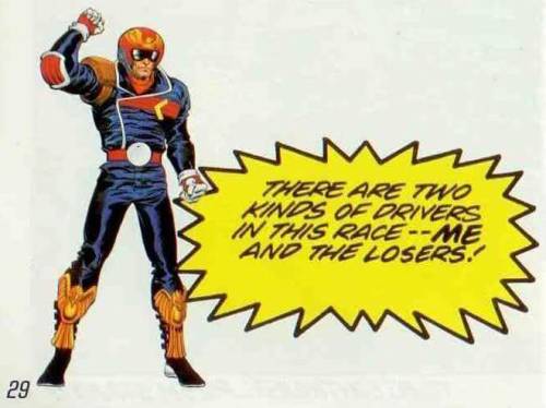
Original Source: F-Zero X
Captain Falcon’s artwork is based of his appearance in F-Zero X, the latest title in the F-Zero series. This is obvious as his appearance in the original F-Zero is very different to the one we all know and love. The render for Captain Falcon is pretty much identical to his F-Zero X artwork although the Super Smash Bros. version appears to be darker in colour which made it a lot harder to confirm, especially when you compare him to the render used in the intro movie. Unlike Jigglypuff and Ness, Captain Falcon actually has a completely different pose for his opening render. I have no idea why this is. The pose he is in with the finger salute seems to be based on his infamous “Show your moves!” taunt that originated here in Super Smash Bros. as the pose is identical. This is rather amusing as it this pose that will go on to be used as the official Captain Falcon pose in both F-Zero GX and Brawl, arguably his most iconic pose. It just goes to show really how much of Captain Falcon as a character was defined by Super Smash Bros.


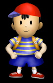
Original Source: Earthbound
Ness’ artwork comes from his official artwork in Earthbound and is definitely his most iconic pose. There is not a whole lot to say about Ness’ render as it falls in line with other renders like Mario and Donkey Kong where it is essentially spot on with only a few touch-ups done here and there to make the colour brighter. Even his intro render is just a high quality version of his CSS render as I mentioned before. Ness did not have much official artwork before this as he had only appeared in one game so there was not a lot of choice on what to base it on.
With Ness out of the way we have covered all of the character’s whose renders were pretty straightforward but there are still two fighters left to cover: Kirby & Luigi. These two each have something unique about their CSS render that made me decide that I needed to keep them separate from the others.
The Original Duo
While all of the renders so far can be traced back to one particular source, the renders for both Kirby and Luigi are instead original renders that were made of an amalgamation of various official artworks. They also break from the mold of all the previous renders which have taken from either their most recent main series title or the title that has had the most influence on their appearance in Super Smash Bros. (Pikachu being the other exception). So first, I will start with Kirby.


Original Sources: Kirby’s Adventure & Kirby Super Star
Kirby’s render used in the CSS for Super Smash Bros. bears very close resemblance to the a piece of artwork showing Kirby running from Kirby’s Adventure on the NES. This seems to be the main inspiration for the render used as Kirby has the same expression and is in nearly the same pose. The big difference here is that his foot is on the wrong side of his body and this is what makes it unique. Before this, Kirby had never been depicted like this in any artwork or sprite from any Kirby game. He is always shown as having his foot showing at the front of his body and not the back. His jumping artwork has the foot in this placement however he is not jumping in his Smash render as only one foot appears. Another difference is Kirby’s cheeks being red. This was added in Kirby’s Dream Land 2 as they were black in artwork for Kirby’s Adventure.
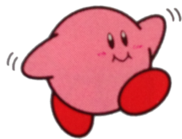
This difference in pose has led me to three conclusion. The first and most unlikely is that Sakurai showed some of his bias here as the creator of Kirby by giving Kirby his own unique render. However, this does not make sense as Luigi also has his own render and Sakurai did not make Luigi. It just seems like extra work that is not needed for Kirby but with Luigi there may be reason. My second conclusion is that, as an employee of HAL laboratories and the creator of Kirby, Sakurai has access to unused artwork from development of a Kirby game and had used that as the basis. Lastly, and most likely in my opinion, my third option is that Sakurai simply moved the placement of the foot as he thought it obscured Kirby’s face on the CSS and maybe even looked weird. We saw this happen with Fox so it is certainly plausible.

Or that’s atleast what I originally thought. I was fully committed to just accepting this as an original render based on Kirby’s Adventure until Nirbion, the guy who makes all of those amazing headers that have been in our articles recently, sent me this. He believes that the render matches up perfectly with the sword Kirby artwork from Kirby Super Star just with all the sword aspects removed and Kirby’s expression changed from angry to what we have in smash. When you mirror the artwork everything matches up from the placement of the hands to, more importantly, the placement of the foot that plagued me so. I now believe that this is the real source artwork, although it is still an original render as any sign of the sword ability has been removed, the image has been flipped and tilted from the original, and Kirby’s expression has been changed to the one found in his running artwork from Kirby’s Adventure. So I believe it is actually a mix between those two, a Kirby that is meant to look like he is running despite the artwork being based on a jumping sword attack.


Original Source: Mario Kart 64, Super Mario 64 & Super Smash Bros.
Finally we come to Luigi, who been saved until the end because he has a huge issue. While Kirby’s seems more like an edit of an already existing artwork, Luigi’s is 100% unique. The render used in his CSS bares a lot of resemblance to the one seen in the intro sequence with two exceptions. Luigi’s hand is not extended in his CSS icon and his eyes are facing a different direction, facing the top left rather than top right. Despite this, his CSS icon is clearly using a slightly edited version of his intro render as the head shape and colours are identical. Due to this, I am going to identify what went into designing the intro render instead. In all my research I have found two pieces of artwork that seem to match up, one of which does not even belong to Luigi.

The first piece of artwork is from Mario Kart 64. I believe this is the artwork used to design Luigi’s head. As Luigi did not appear in Super Mario 64, his only two 3D models from games prior to Smash are both spin-off titles, Mario Kart 64 and Mario Party. The Mario Party render is too lanky and stretched to be the Smash render but the Mario Kart one nearly matches up perfectly. The colours are a slightly different shade from each other but the way Luigi’s eyes, hat, ears, eyebrows, hair, nose and moustache are identical in the Mario Kart artwork compared to his Super Smash Bros. render. The head for the Mario Kart 64 artwork appears to not be as long as the one seen in Super Smash Bros. but that could easily have just been an edit made to accompany the new pose Luigi is making.

Finally, when identifying the pose Luigi is making the on picted above matched up almost perfectly. However, this is clearly not Luigi but is instead Mario from Super Mario 64. However, this is likely the basis for Luigi’s artwork as comparing the positions of the arms and legs as well as the shape of the hand reveals they are identical. The only real change apart from the face is that the Luigi render is thinner because Luigi is thinner than Mario. So, the question now is why did Luigi not get a render from his own artwork like everyone else? I have two theories. The first is that he actually did, but it was from an unreleased piece of artwork related to Super Mario 64. Miyamoto has confirmed in an Iwata asks that Luigi was planned for a potential co-op mode in Super Mario 64 at one point however they could not make it work:
“Iwata: Ever since Mario Bros., you’ve had your heart set on making a multiplayer Mario game. You’ve tried each time, but it’s never quite come together… Even with Mario 64, it started with Mario and Luigi running around together, didn’t it?
Miyamoto: That’s right. The screen was split and they went into the castle separately. When they meet in the corridor, I was incredibly happy! (laughs) Then there was also the mode where the camera is fixed and we see Mario running away, steadily getting smaller and smaller.
Iwata: Yes, that’s right.
Miyamoto: That was a remnant of an experiment we did where Mario and Luigi would run away from each other but you could still see them both. But we were unable to pull it off…”
It is unsure how far into development this got, but if artwork was ever drawn of Luigi for this mode then it may be possible that we are seeing some of it here as we know that Sakurai could have had access to beta imagery due to his render of Link. My second theory actually pertains to the way Luigi is in Super Smash Bros. 64. As I have said many times, the artworks chosen to represent the characters CSS icons are directly related to the way that character is portrayed in the original Super Smash Bros. Mario and Captain Falcon are from their most recent game, Donkey Kong and Yoshi are from the games where they are the main protagonists and not side characters, and Jigglypuff is from her main inspiration for her inclusion. So with Luigi, he is in fact the first clone character introduced in the Super Smash Bros. franchise being a clone of Mario and so it makes sense that even his render is actually just a copy of one of Mario’s artwork. This artwork was most likely chosen as the source as it bears resemblance to one of Luigi’s moves, similar to Captain Falcon’s intro render being based on his in-game taunt. The render was changed in the CSS for two reasons; the first was to not make it as cluttered with Luigi’s arm taking up the whole right side of the icon and second, to mirror Mario’s CSS artwork as mario is looking into the upper right corner of his icon while facing left and Luigi is instead facing right while looking into the upper left corner of his icon. This reflects his clone status once more and also means his render is based on another Super Mario 64 artwork as that is what Mario’s render is based upon.

Sakurai really likes to make Luigi stand-out in this game. From this CSS artwork to the fact that Luigi’s alts. on the official Super Smash Bros. site are the only ones that all share the same pose to the fact that Luigi is the only unlockable character in the game that is shown before he is unlocked (in the ‘How to Play’ video and also in classic mode alongside Mario). I wonder if Sakurai had some personal affection for Luigi in this game that made him want to treat Luigi differently from the rest? I guess that is an article for another day.
So in conclusion, it appears that Sakurai’s decision for which artwork to go for with his characters is primarily based on which game gets the most representation from that series in Super Smash Bros. For Mario it is Super Mario 64, for Donkey Kong it is the first Donkey Kong Country, and for Kirby it was Kirby Super Star. The one exception to this are the Pokemon as their artwork is not from Red & Blue but the TGC and Anime. I hope this has been interesting to read as I really enjoyed doing the research for this one. It was really interesting seeing all the different artwork for Nintendo’s franchises. Let me know what you think, was I right in my analysis? Did I miss a Luigi artwork anywhere that proves me wrong? Please, let me know!

![]()
![]()
![]()
I am aiming to be more on Twitter from now on so follow me if you want to see my work, both from source gaming and out of it. I promise I will try and be interesting and fun to follow.

- SG Roundtable: Favourite Indie Multiplayer Game (Patreon Request) - April 4, 2024
- On Your Tail – Hands-on Impressions - November 15, 2023
- EGX 2023 Previews #2 – Like a Dragon Infinite Wealth, Eastward: Octopia and more! - October 14, 2023


Sorry for the caps but, YES I ALWAYS WANTED SOMEONE TO TALK ABOUT THAT.
thank.
It was very interesting, and you analysed/researched it really well. My only critic is that sometimes the writing gets repetitive, for example, you say 3 times that DK’s render comes from DKC1. But it’s not too much, nice article.
I never knew about this before! That’s a cool little detail! Shows that even as far back as the first game, Sakurai really wanted the characters to feel authentic to their games.
Great article, Nantendo! I just have one thing to point out, though.
Pikachu’s artwork actually IS based on its official art from Red and Blue as far as I can tell. The card actually uses its artwork directly: http://www.pidgi.net/wiki/images/thumb/8/82/Pikachu_(alt)_-_Pokemon_Red_and_Blue.png/386px-Pikachu_(alt)_-_Pokemon_Red_and_Blue.png
I remember seeing this art plastered all over Nintendo Power and the official Player’s Guide back in the day. The only argument against this is if Nintendo used the art from the card for the official material, but if the card was produced by Wizards, it seems more likely Pikachu had multiple official arts and Wizards just lifted one of them for the card.
Any idea when the promo cards were produced?
I do agree with the correction of Pikachu’s artwork. However, as in additional info according to my historical Pokemon knowledge, the artwork was basically came from the Japanese Pokemon Blue version, which was the special version of the original Red and Green, as it was never released at any stores (but you can buy it at certain retro game shops like in Akihabara today), but purchasing it through mailing by Shogakukan magazine’s limited time only event. The official artwork was redesigned for this version’s release, as the previous Red/Green version was different from the original base. So, just like you said, it’s not from the card games as the cards were released AFTER Blue version was out.
For Jigglypuff’s in other words, was brought from the Japanese Pokemon Red and Green’s original artwork. It’s not from the anime version since the anime series wasn’t released back then, but it is similar except not in Ken Sugimori’s original design. Sorry I couldn’t provide any evidence since the original artwork is no where to be found through Google because its really REALLY old and no longer mentioned, and actually I found it but this site somehow wouldn’t let me put on the link to that picture. I do also have the original artwork from the Japanese Pokemon Red/Green strategy guide that I still have in my storage room, but I think it’ll be impossible since I don’t know how to post pics here.
The anime was out before Super Smash Bros in japan and sakurai said it was used as a source. This was the only artwork i could find where jigglypuff was making this pose and as she was chosen because of her importance in the anime it just seem to make sense. Although if you do have proof of red and green pokemon artwork of jigglypuff then you can e-mail or tweet me the link/picture. Both should be in the about us section on the site.
As for Pikachu it did seem weird to me that it started with the TCG. I had people showing me pokemon red & blue strategy guides and what-have-you with this artwork on the front but doing some research i quickly discovered that all of these books came out a few months after Super Smash Bros did in japan. That pikachu is drawn by Ken Sugimori but whether it was used first for Pokemon advertisements or for the TCG i can’t tell. If it was released for the Japan only blue version, do you have any pictures of the magazine or anywhere i might find a picture? I do think a lot of Pokemon art was drawn for the original games but if they were not shown alongside them then i feel like i should source the first thing we saw this artwork used for which seems to be the cards.
As for the wizards Promo card, i actually linked its first appearance in the west but its second version in Japan.
http://bulbapedia.bulbagarden.net/wiki/Pikachu_(Wizards_Promo_1)
This is the bulbapedia article on the original card which came out in november 1996, 2 years and 2 months before smash and one month after pokemon blue.
Found the art for Jiggs: http://archives.bulbagarden.net/wiki/File:039Jigglypuff_RG_2.png
Also for Pikachu: http://archives.bulbagarden.net/wiki/File:025Pikachu_TCG.png (despite the file name for this one, check the summary below.)
Ken Sugimori’s artwork was never exclusive to the TCG back then, nor did it debut in the TCG. The TCG art by Sugimori was *always* previously existing artwork made for the games, plastered onto different backgrounds. Nowadays he does do TCG exclusive pieces, particularly for full art cards, like Lysandre or N, but this was never the case in the early days of the TCG.
Sugimori’s illustrations for the games were indeed the basis for the Smash 64 character select images. It is also correct that these particular pieces of art originate from the Japanese release of Blue (through CoroCoro Magazine) in October 1996 and the international release of Red and Blue in 1998, as many Pokémon designs were reworked after the initial release of Red and Green in February 1996. The TCG was first released in Japan just 5 days after the limited release of Blue. As such, all of the artwork in the TCG (be it Sugimori’s art or not) uses the final and revised designs for the Pokémon over the original Red and Green designs. The international release of Red and Blue are based on the revised Japanese Blue version, which is why Nintendo Power, strategy guides and other materials outside of Japan also use this art exclusively.